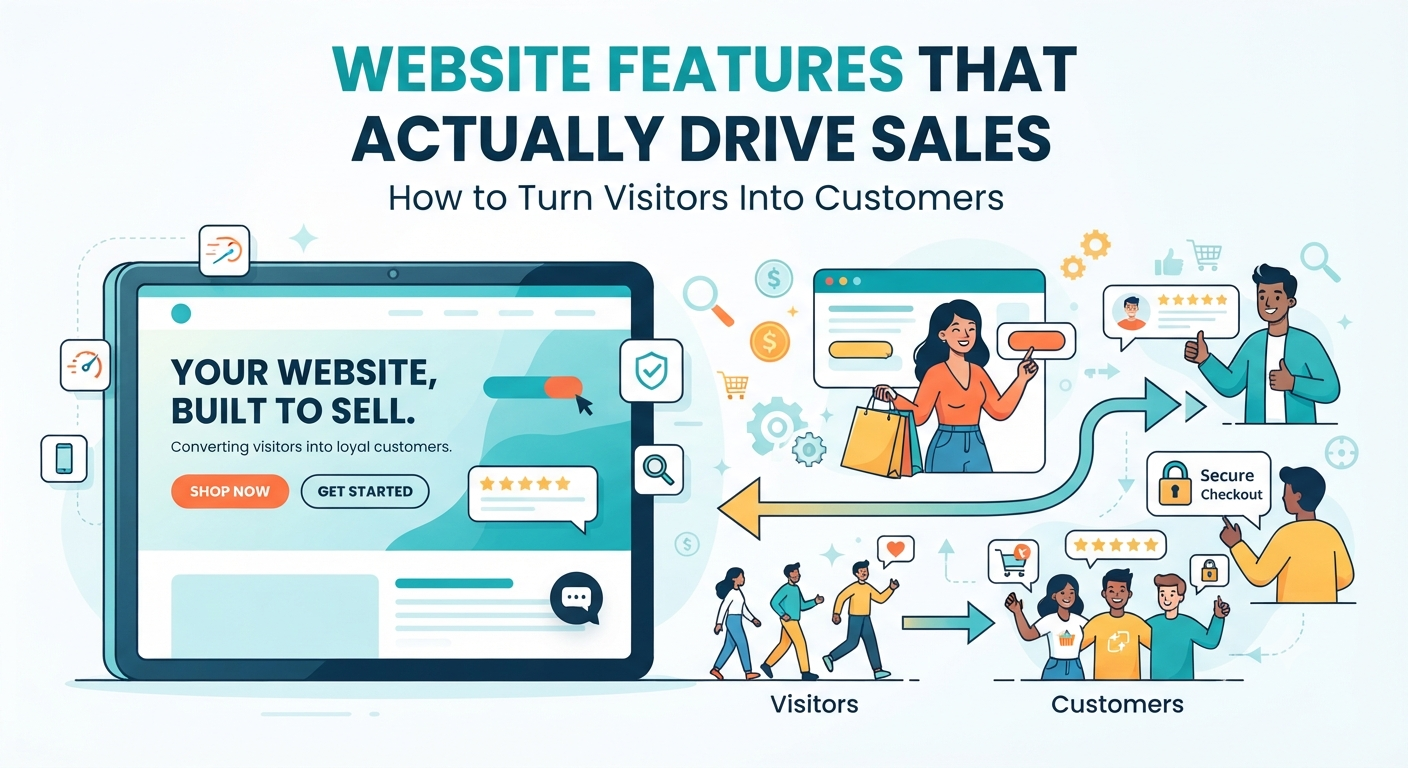
Website Features That Drive Sales: Convert Visitors Into Customers
These days, your website isn’t just a business card that sits pretty online. It’s your sales rep, your customer service agent, your marketing team, and the voice of your brand always on, day and night.
The big mistake? Lots of business owners pour money into a slick design, but totally miss the parts of a website that make people actually want to buy. So their sites look great and even pull in visitors, but nothing actually happens. No phone calls. No enquiries. No sales.
Here’s the difference: a good-looking site just sits there, but a smart one is built to work to guide, convince, and convert. Every bit matters, from the main headline right down to where you put your contact button. All these choices help tip visitors from curious to customer.
If you’re serious about making your website a true sales tool, don’t skip these features.
1. Make a Strong First Impression
People judge your website in seconds. If they land on your homepage and can’t figure out what you do or how you help them, they’ll bounce fast.
So, right at the top, make it obvious:
- What your business offers
- Who you serve
- Why you’re the smart choice
Throw in a clear headline with a line that focuses on what’s in it for them.
Like: “Professional websites built to help businesses get more leads and close more sales.”
It’s clear, direct, and focused on the customer.
2. Fast Loading Speed Keeps People Around
No one wants to wait for a slow site. When pages drag, people leave before they even see what you offer.
A quick website means:
- People enjoy their visit
- Google ranks you higher
- Fewer people leave right away
- More actions, like enquiries or purchases
Speed isn’t just tech stuff it’s a sales move.
3. Mobile-First Design is a Must
Most visitors browse on their phones. If your site’s a headache on mobile, you lose business before you ever get a chance.
Here’s what mobile-friendly looks like:
- The layout adapts to any screen
- Text is easy to read
- Buttons work with a tap
- Everything loads fast
- The menu makes sense
This kind of experience keeps people on your site longer and nudges them to take action.
4. Clear Calls-to-Action
Every page has one job: tell your visitor what to do next.
Need them to ask for a quote? Book an appointment? Buy now? Make it loud and obvious.
Use buttons like:
- Get a Free Quote
- Book a Consultation
- Start Your Project
- Shop Now
The right call-to-action removes any guesswork and moves people closer to choosing you.
5. Build Trust Before You Sell
Nobody hands over money if they don’t trust you. So show proof.
Add things like:
- Real customer reviews
- Testimonials with names
- Client logos
- Success stories
- Awards or certifications
- How long you’ve been in the game
These details help people feel safe picking you.
6. Real, Professional Images
Photos matter a lot more than most businesses assume.
Ditch the obvious stock images. Use:
- Real photos of your team
- Your actual workspace
- Product photos
- Before-and-afters
- Videos that show real results
Authentic visuals make your brand human. People connect with what’s real.
7. Navigation Should Be a No-Brainer
Don’t make visitors dig for details.
Your menu should make it easy to find:
- Services or products
- Prices
- About your company
- Contact info
- FAQs
When your site is easy to get around, folks are way more likely to stay and explore.
8. Fast and Easy Communication
A lot of people leave because they just can’t get a quick answer. Let them reach you easily.
Put options on your site like:
- WhatsApp or live chat
- Call buttons
- Easy contact forms
- Clear email support
Quick replies mean more sales.
9. The Right People Need to Find You SEO
Great design is useless if no one visits. SEO gets you found by people who already want what you offer.
That means:
- Content with keywords people search for
- Optimized page titles and meta descriptions
- Good internal links
- Fast-loading, image-optimized pages
Organic traffic is gold they’re already looking for you.
10. Security Customers Can See
People expect their info to be safe. Show them they can trust you.
That means:
- HTTPS (the little padlock)
- Secure payment options
- Privacy policies
- Terms and conditions
A safe website makes visitors much more likely to buy or share their details.
11. Lead Generation Tools
Not everyone’s ready to buy today. Give them a reason to stay in touch.
Offer:
- Free consultations
- Downloadable guides
- Checklists
- Email newsletters
- Discount codes
- Simple quote forms
Reconnect with them later and turn interest into sales.
12. Use Analytics to Learn and Improve
Guesswork? Forget it. Let data show you what works.
Track things like:
- Where people come from
- Which pages get the most action
- What products get attention
- Where people drop off
Those numbers help you tweak your site so more visitors turn into customers.
Common Website Mistakes That Drive Customers Away
Even well-designed sites lose sales for silly reasons, like:
- Pages that crawl
- A clunky mobile layout
- Navigation that’s all over the place
- Weak, vague headlines
- Buried contact info
- No social proof or reviews
- Pop-ups everywhere
- Forms that take forever to fill out
- Old, outdated look
- Calls-to-action that are missing or bland
Fixing just a few of these can turn things around, fast.
Your Website Should Pull Its Weight
A website shouldn’t just sit there it should bring in business.
Every visitor is a shot at a sale. If your site is fast, clear, inviting, and built with the customer in mind, it’ll guide people naturally toward the next step.
The best-performing sites don’t need bells and whistles. They solve real problems, feel trustworthy, and make everything easy. If you’re getting lots of visitors but few leads or sales, don’t jump straight to paying for more traffic. Start by making things better for the people already showing up.
A high-converting website isn’t an accident. It’s built on purpose.